Going Underground
When I first moved to London I spent a lot of my time being lost. It’s a big place, and since I was on the Tube a lot I found it tough to get a good intuition for where things are overground. So I did what I normally do when I don’t understand something, I got some data and I did some analysis.
All the code below lives in one of two repos.
Maps
The Tube is great, and the classic circuit-board Tube map is an amazing piece of design. It makes the layout of London easy to visualise, and its basic design concepts have been adopted by transport systems around the world. I’ve always had trouble with it though. The map doesn’t have any scale, the distance between stations on the map bears no relation to their separation in reality. To make matters worse it doesn’t preserve relative position, places that are North-South (or East-West) of one another in reality are often reversed on the map. When I first moved over to London my mental map of the city was the Tube map, but since this is more of a schematic than a map I found it hard to orient myself. I decided that a good way to get a feel for things would be to get some data and make some maps of my own.
TfL are great when it comes to open data, and it’s as a result of their open data that tools like CityMapper exist. Using their API I was able to get a bunch of data on the stations, most importantly their latitude and longitude. The data I pulled includes 274 stations,1 but unfortunately doesn’t include the extensions to the Overground or the DLR – which is fine by me because I don’t count the DLR as a real train anyway. So here’s what the network looks like on a geographic map:
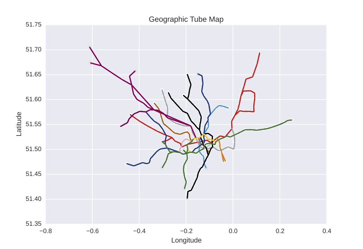
I already feel more oriented. This gives me a good sense for the extent of the network (it’s big), and for the relationships between the lines (what is going on with the Metropolitan line?). I was going to plot this on a distance2 rather than lat/lon scale but one thing I really like about this is that you can see there are a bunch stations almost exactly on the meridian.3
Travel Times
Using the API the next thing I grabbed is the travel time between stations along each of the lines, i.e. what you get if you got on the train with a stop-watch, timing how long it took to get between stations, and did that for each line. With these data I can build a full station-to-station travel time matrix, using the Floyd-Warshall algorithm.4 This gives me a $274\times274$ array where each location, $(i, j)$, holds the minimum travel time by any route between stations $i$ and $j$.
In [5]: times
Out[5]:
array([[  0.  ,  30.75,  31.89, ...,  40.04,  49.07,  48.86],
       [ 30.75,   0.  ,   5.14, ...,  24.39,  22.32,  36.21],
       [ 31.89,   5.14,   0.  , ...,  25.53,  21.78,  37.35],
       ...,
       [ 40.04,  24.39,  25.53, ...,   0.  ,  42.71,  38.6 ],
       [ 49.07,  22.32,  21.78, ...,  42.71,   0.  ,  54.53],
       [ 48.86,  36.21,  37.35, ...,  38.6 ,  54.53,   0.  ]])
This is really useful; geographic maps are nice but with this I can start visualising the thing we really care about, how long does it take to get where I’m going?
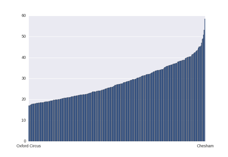
First thing is to rank the stations by centrality, on average how long will it take me to get to any other station in the network from where I am? No prizes for guessing the best is Oxford Circus, at 17 minutes average travel time, and the worst is Chesham, where the average journey takes an hour.
We can also look at the distribution of travel times from a given station, using the pyjoyplot module I made. Picking out 10 stations at random we get these travel time histograms
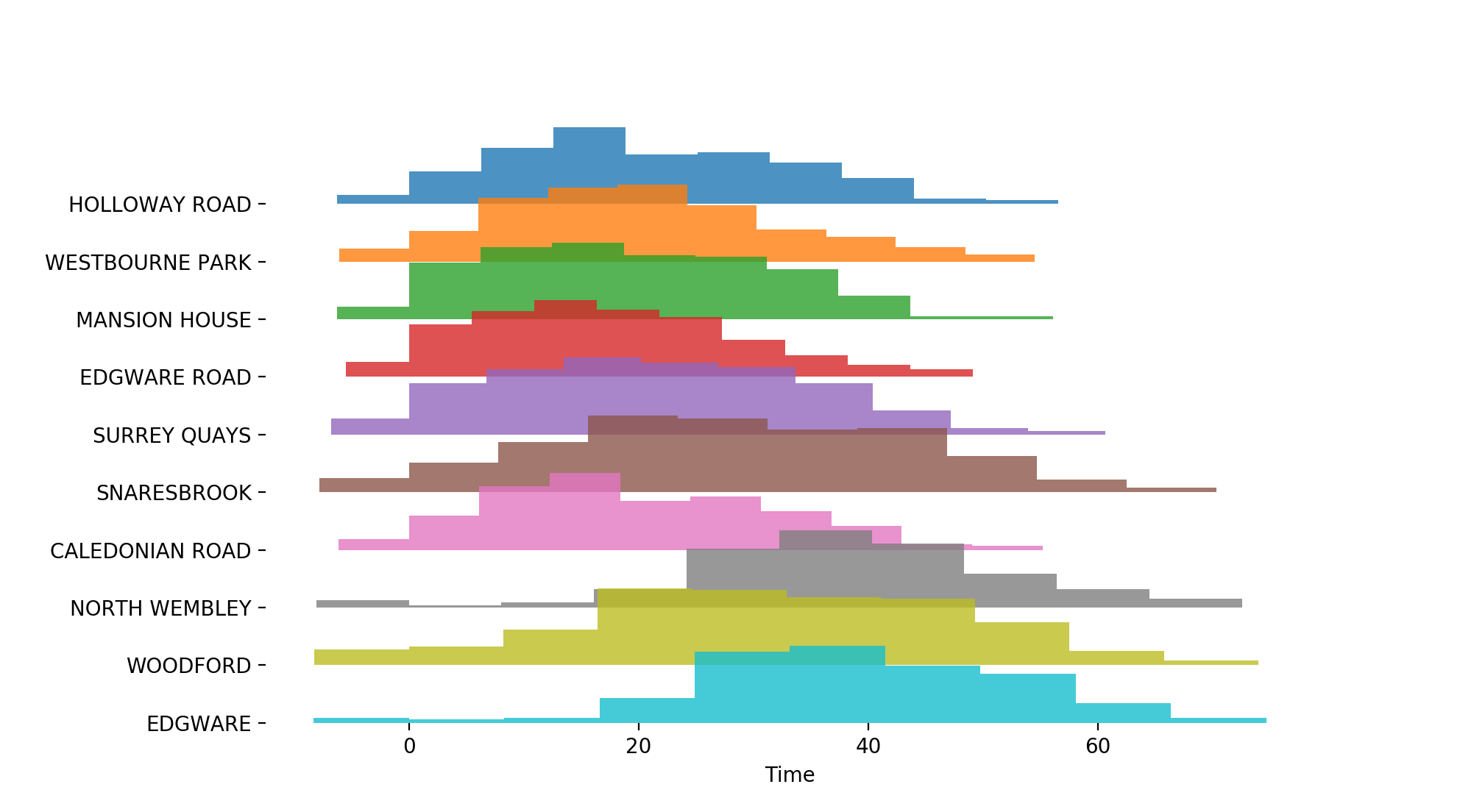
As you’d expect these distributions are quite wide, but there’s a big difference between somewhere like Holloway Rd and North Wembley – and, confusingly, between Edgware and Edgware Rd.
Time Maps
We can use these data to start building travel-time maps for each station too. To start with I made polar plots with the station we’re at in the centre and the other stations dotted around. In these maps the radial distance represents the travel time, and the angle (loosely) corresponds to the cardinal direction you travel in to get from station $a$ to $b$. From Oxford Circus the network looks like this
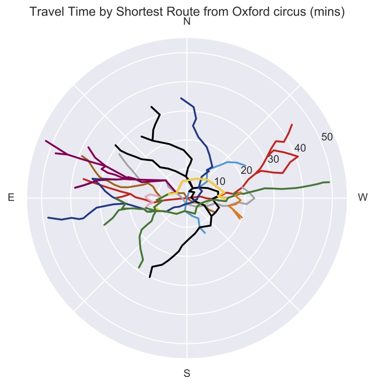
This is really cool, we can see where everywhere is relative to us, and how long it would take to get there. We can see that the only place it takes more that 50 minutes to get to is Chesham, travelling East/North-East. From their perspective things look less appealing
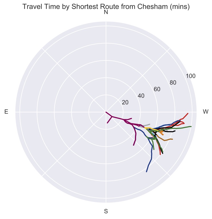
It’s going to take you 100 minutes to get to the end of the District Line, so bring a book.
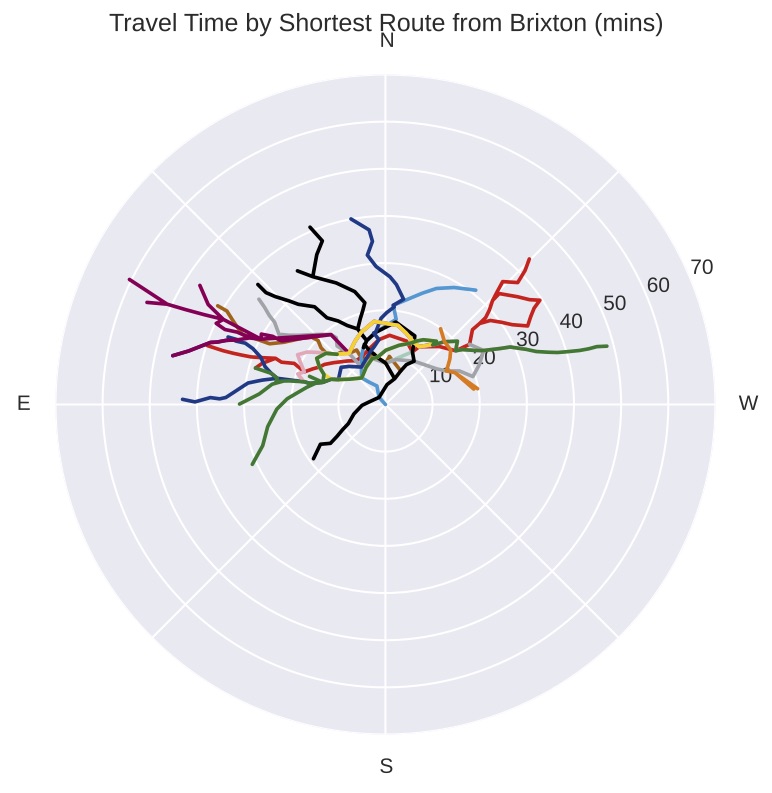
I think these plots are really cool, so here’s one more for good measure, Brixton
Embedding
This is interesting but it’s unsatisfying that we have to do it on a station by station basis, it’d be better if we could visualise all of this matrix at once. The best way to do that is to treat the travel times as distances between the stations and find an embedding of stations that satisfies those distances. That is to say, some places that are really close by one another, but take a very long time to get between on the Tube – a travel time embedding would re-draw the map, pushing places like these away from one another and closer to places that you can get to more quickly by train.5
My first pass at making a map like this was using Multi-Dimensional Scaling. Using this algorithm gives something like this (up to a random seed)6
This is really cool, but it doesn’t seem to quite work… It recreates the geographic layout quite well, which you’d sort of expect as that should still be the decisive factor in travel time, but it seems to fall down on some stations. There are pairs of stations here that are close together in space but far apart in travel time getting embedded next to one another (e.g. Highbury and Caledonian Rd). I decided to try again with a different type of emebedding algorithm. This method treats the stations as connected by springs whose springy-ness is determined by the travel time and it looks for the lowest energy state of those springs.
Alright, this gives a really different result. Again you can sort of see where this comes from. We can see that the network extend a lot more East-West than it does North-South, and we can see that this method does a slightly better job of not keeping far away stations away from one another. But it’s still far from ideal.
Thinking about it for a minute you can see where these methods fall down. London, for a person traveling around, is a 2 dimensional object, and the travel time between 2 places is proportional to the distance between them on this 2D surface.
What the Tube does is take distant places and reduce the travel time between them, in effect pinching together the 2D manifold at these places. And the only way to pinch them together is to use a 3rd dimension. So in some sense the natural home for our travel-time map is 3 dimensions. We can use the MDS algorithm to embed the distances in 3D and we get this
This is more like it! Giving the map a 3rd dimension to extend into makes for a much better embedding. Playing with this map we can see the relationship between places a lot more clearly. The Northern line for instance, which was a problem for the other embeddings, takes full advantage of the 3rd dimension – we can see it loop out of the plane to ensure that the Northern and Southern ends, really far apart in space but close in time, can come together.
Conclusions
I don’t know about you but after all that I feel like I have a much better idea of the layout of London.
-
Which really is a lot, I wouldn’t have guessed there were that many. ↩
-
$0.1^\circ$ longitude is about 7km, and $0.05^\circ$ latitude is about 5.5km. ↩
-
East India (-0.0021 longitude), North Greenwich (0.0039), and Stratford (-0.0042) are the closest, all within 30m of the meridian. ↩
-
This ignores changing at stations, but it should still be a good approximation. ↩
-
An example would be West Ruislip and Ruislip. They’re right next to one another, but to get between them on the Tube you’d need to take the Central line in and the Piccadilly line back out. From the Tube’s eye-view, West Ruislip is closer to somewhere like King’s Cross (two trips on two fast lines), than Ruislip. We want a map that reflects this. ↩
-
All the interactive plots here were made using Bokeh. If you’re not seeing plots here it’s possible that your browser/adblocker is blocking the PyData CDN. ↩