Joy Plots in Python
Joy Plots are a really handy way to get a quick, qualitative impression of a data set. They also look really cool. So I decided to put together a Python package to make them.
Joy plots have been around a long time, but have become popular in the last while in the data visualisation community. The name doesn’t come from the the sense of joy engendered by looking at the plots but from the band Joy Division, who put one on the cover of their classic Unknown Pleasures album. It’s a slightly cryptic album cover, just a series of spiky line plots, white-on-black, stacked to create a kind of 3D mountain range effect. It’s an image that you’ve definitely seen, even if you’ve never listened to music in your life.
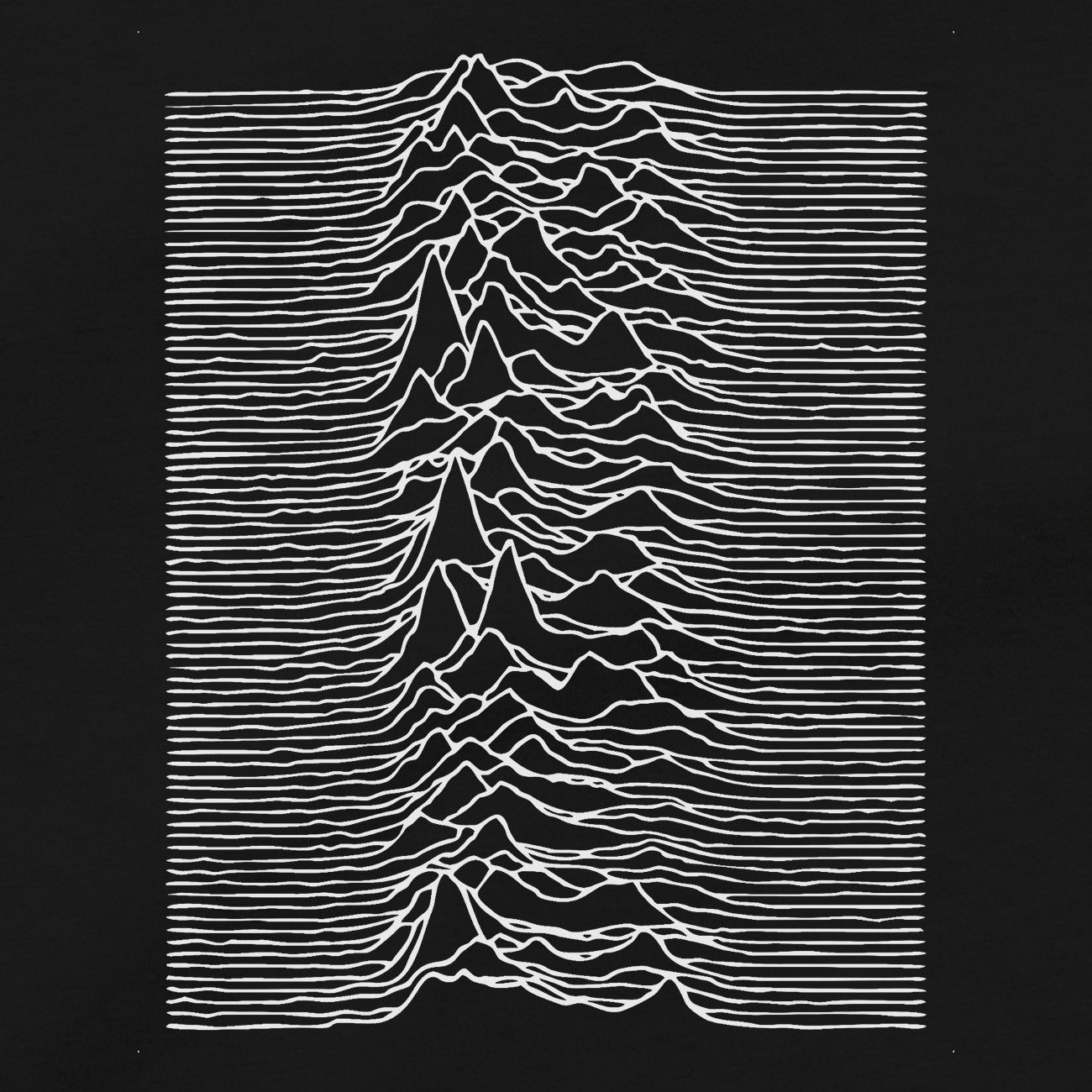
You’d have to agree that this is a very cool plot, and it’s probably the most famous piece of data visualisation ever. Like most good things it’s got an astrophysics connection, the data plotted here are observations of the first pulsar discovered, CP-1919. Pulsars are rapidly rotating neutron stars that emit pulses of radio waves as they spin - think of the beam from a light-house. This plot shows the intensity of the radio waves detected; each line represents one rotation, with time running left to right, and successive rotations are stacked from bottom to top. These objects were discovered in 1967 by Northern Irish astronomer Jocelyn Bell Burnell while she was a PhD student at Cambridge. She didn’t make this image however, it comes from the PhD thesis of a guy called Harold Craft. A good plot is timeless, and in my own doctoral work I found myself using exactly this kind of plot to look at how light from binary stars changed as the stars orbited one another.
You don’t need to be an astrophysicist to make these though, any time that you’ve got data that can be grouped according to some categorical variable then joy plots can be a good tool to use. Since the end of last summer I’ve seen a lot of these plots around, probably because of the release of the R package ggjoy (since rebranded ggridges). Last summer I decided to write a Python package to do the same job, the source code is here and you can download it from Pip pip install pyjoyplot.
The package itself is pretty straightforward, it’s just a thin wrapper to matplotlib. It uses the same kind of API as seaborn, it consumes a dataframe along with some keywords and gives back an ax object. To give you an example, here’s a data set that I can across online:
| activity | time | playing | Hours |
|---|---|---|---|
| Playing football | 380.0 | 0.000006 | 6.333333 |
| Playing baseball | 940.0 | 0.000367 | 15.666667 |
| Playing baseball | 630.0 | 0.000124 | 10.500000 |
| Rollerblading | 330.0 | 0.000004 | 5.500000 |
| Wrestling | 985.0 | 0.000072 | 16.416667 |
| Dancing | 760.0 | 0.000069 | 12.666667 |
| Dancing | 900.0 | 0.000185 | 15.000000 |
| Dancing | 100.0 | 0.000376 | 1.666667 |
| Playing racquet sports | 645.0 | 0.000424 | 10.750000 |
| Wrestling | 695.0 | 0.000022 | 11.583333 |
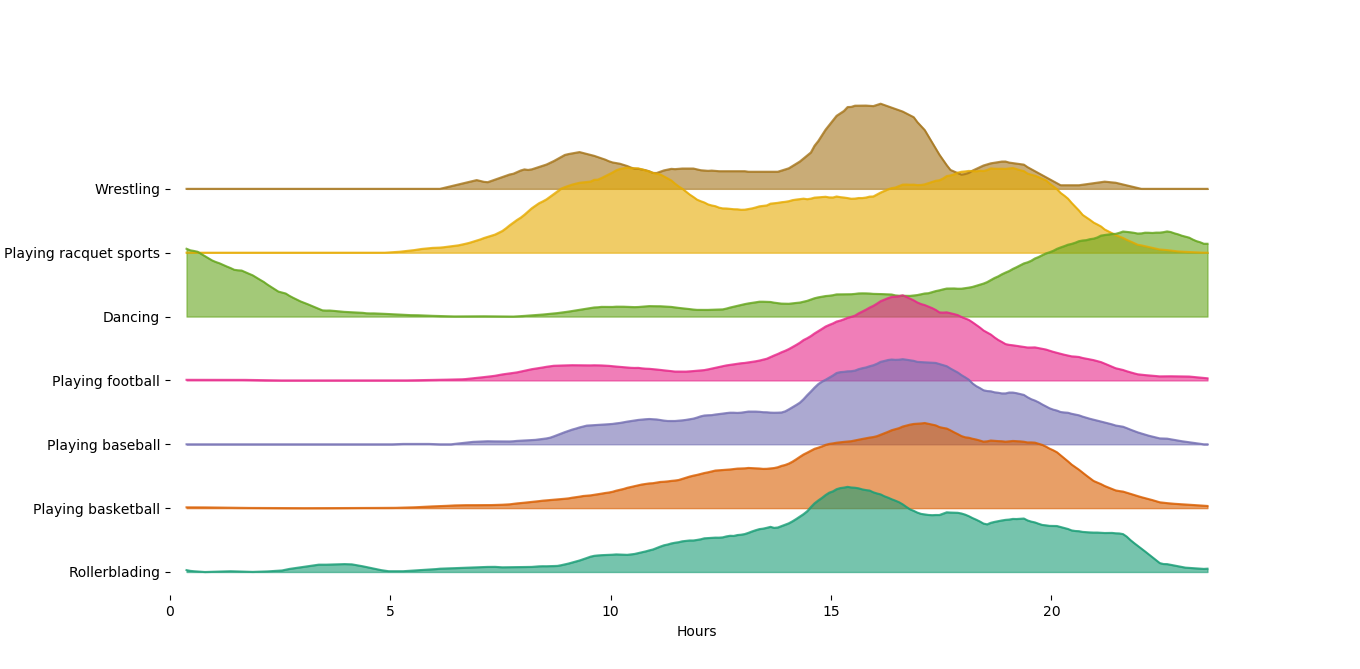
This data set contains a bunch of sporting activities, a set of times (in minutes since midnight), and a proportion of people doing the acitivities at that time. I think. Anyway it’s not really important, the point is we can use pyjoyplot to visualise these data.
import pyjoyplot as pjp
import pandas as pd

df = pd.read_csv('sports.csv')
df['hours'] = df.time / 60

pjp.plot(data=df, x='hours',  y='playing', hue='activity')
We hand in the dataframe, and specify the $x$ axis, $y$ axis, and the hue, where hue designates the categorical variable to be grouped over, and we end up with this:
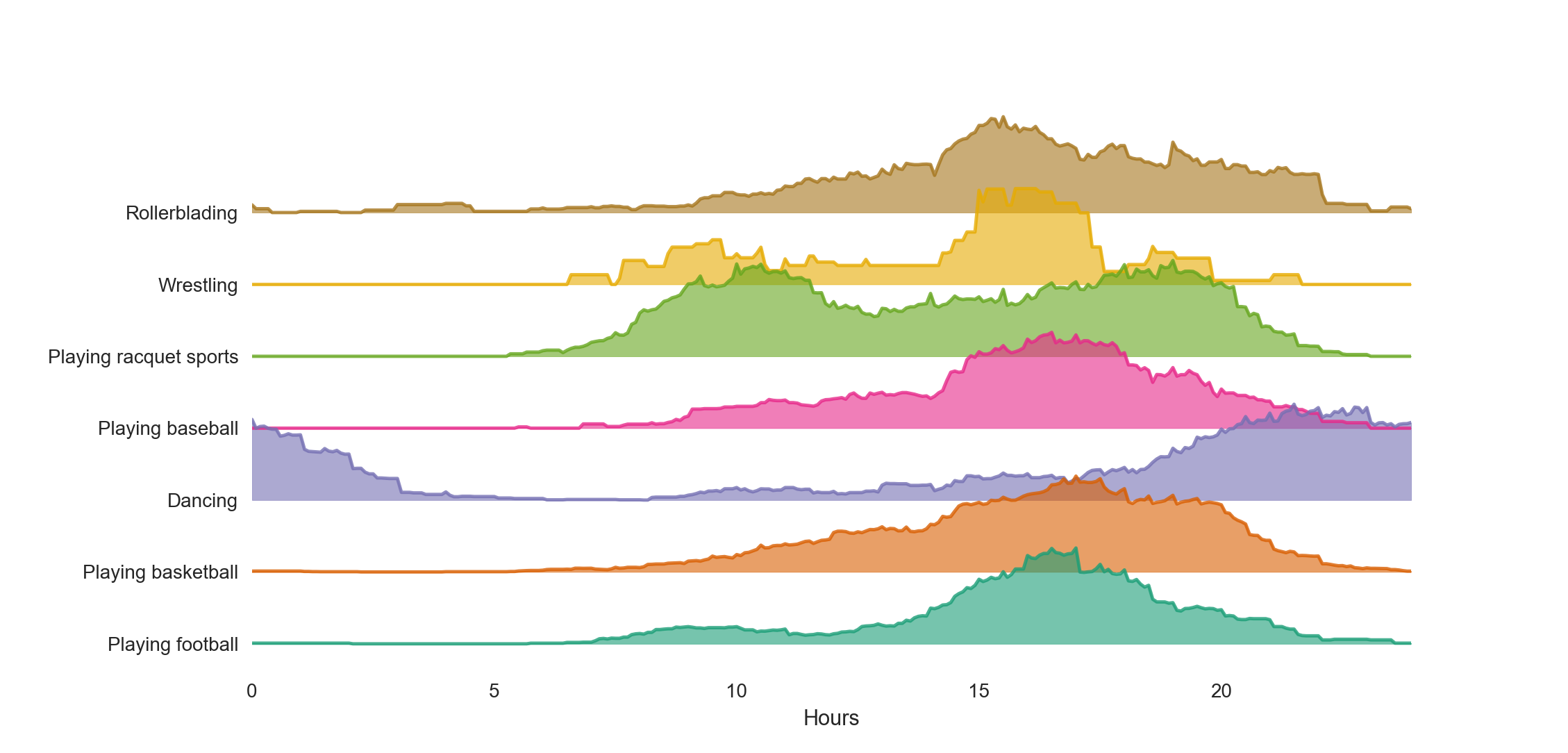
Easy! These data are a bit rough around the edges, so maybe we’d like to smooth them a little to make things cleaner. To do that we can just set the smooth parameter which computes a rolling mean using a sliding window of whatever width you specify:
pjp.plot(data=df, x='hours',
              y='playing', hue='activity', smooth=10)
and we get
Nice and straightforward, and not a bad looking plot if I do say so myself.
One other thing that the package support is stacking histograms. Take the classic iris data set,
| sepal_length | sepal_width | petal_length | petal_width | species |
|---|---|---|---|---|
| 5.5 | 2.3 | 4.0 | 1.3 | versicolor |
| 7.3 | 2.9 | 6.3 | 1.8 | virginica |
| 5.2 | 4.1 | 1.5 | 0.1 | setosa |
| 6.7 | 3.1 | 4.7 | 1.5 | versicolor |
| 6.8 | 3.0 | 5.5 | 2.1 | virginica |
Here we have 4 parameters for 3 different kinds of iris. Let’s say we wanted to get an idea of the distribution of sepal length for each type, we can do this:
pjp.plot(data=iris, x='sepal_length', hue='species', bins=10, kind='hist')
Much as before we hand in the dataframe, specify the variable we want to bin as $x$, and the variable we want to group on has hue. This time however we say that we want a histogram, and give a number of bins too, and we get:
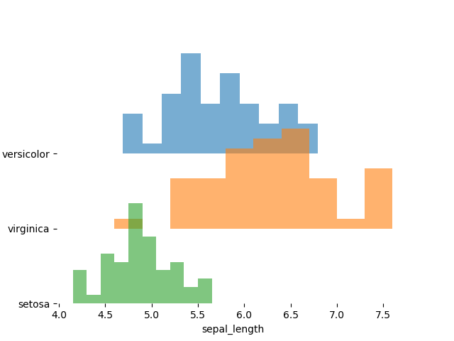
Lovely.
I’ve seen a bit of interest in making plots like these in the last while, seaborn posted a recipe, bokeh too, and there’s at least one other package out there, so you’re spoiled for choice!